We've Been Warned
Warning signs and labels are everywhere these days, protecting us from ourselves in ways most probably never thought would be necessary. "Careful, the beverage you're about to enjoy is extremely hot" is one of my favorites. Thanks for the heads-up, Starbucks! Because of their ubiquity it's easy to become desensitized and not take them as seriously as perhaps we should.
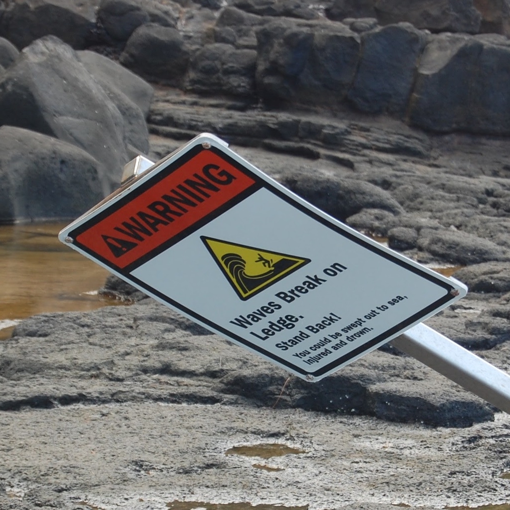
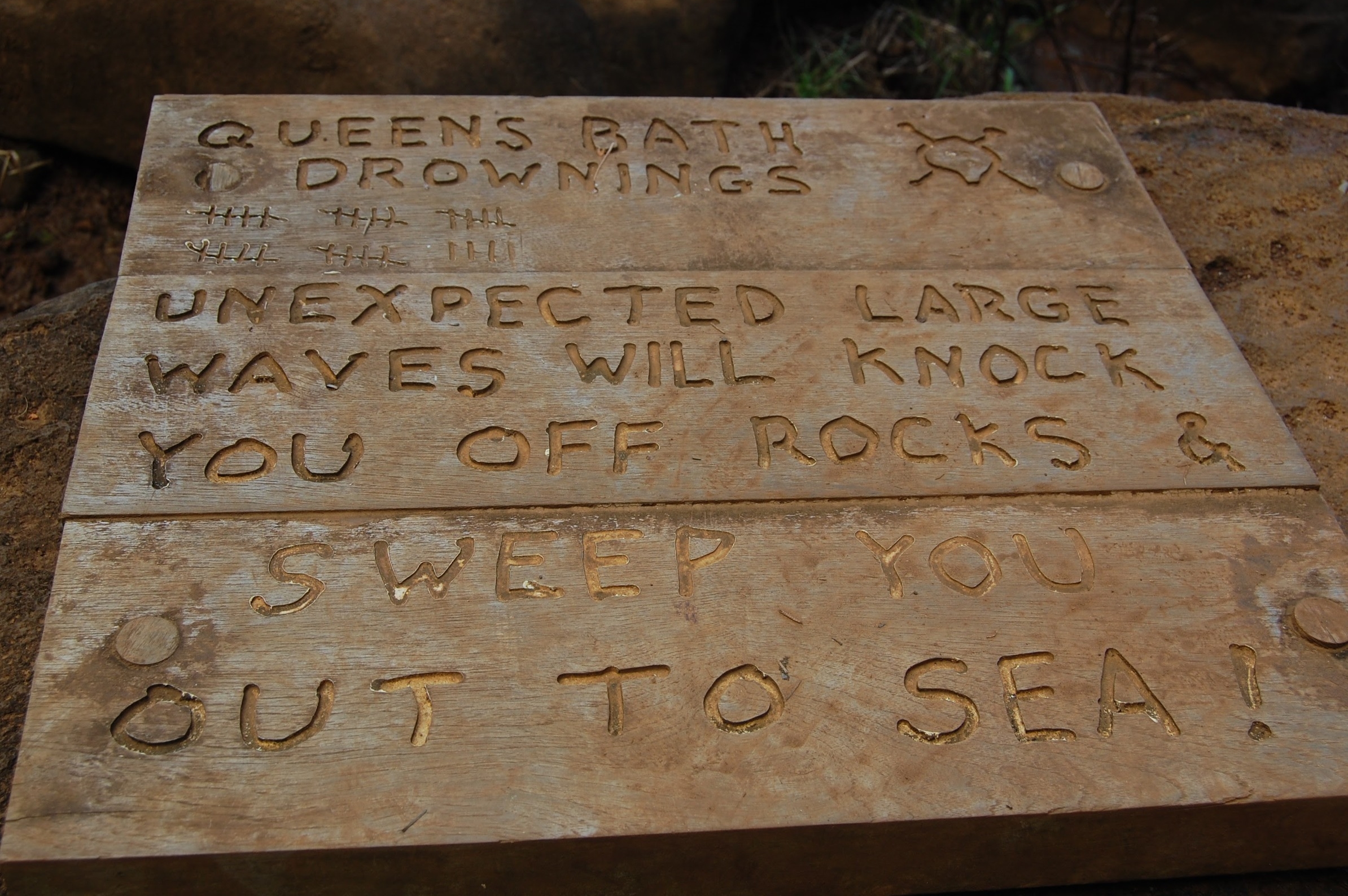
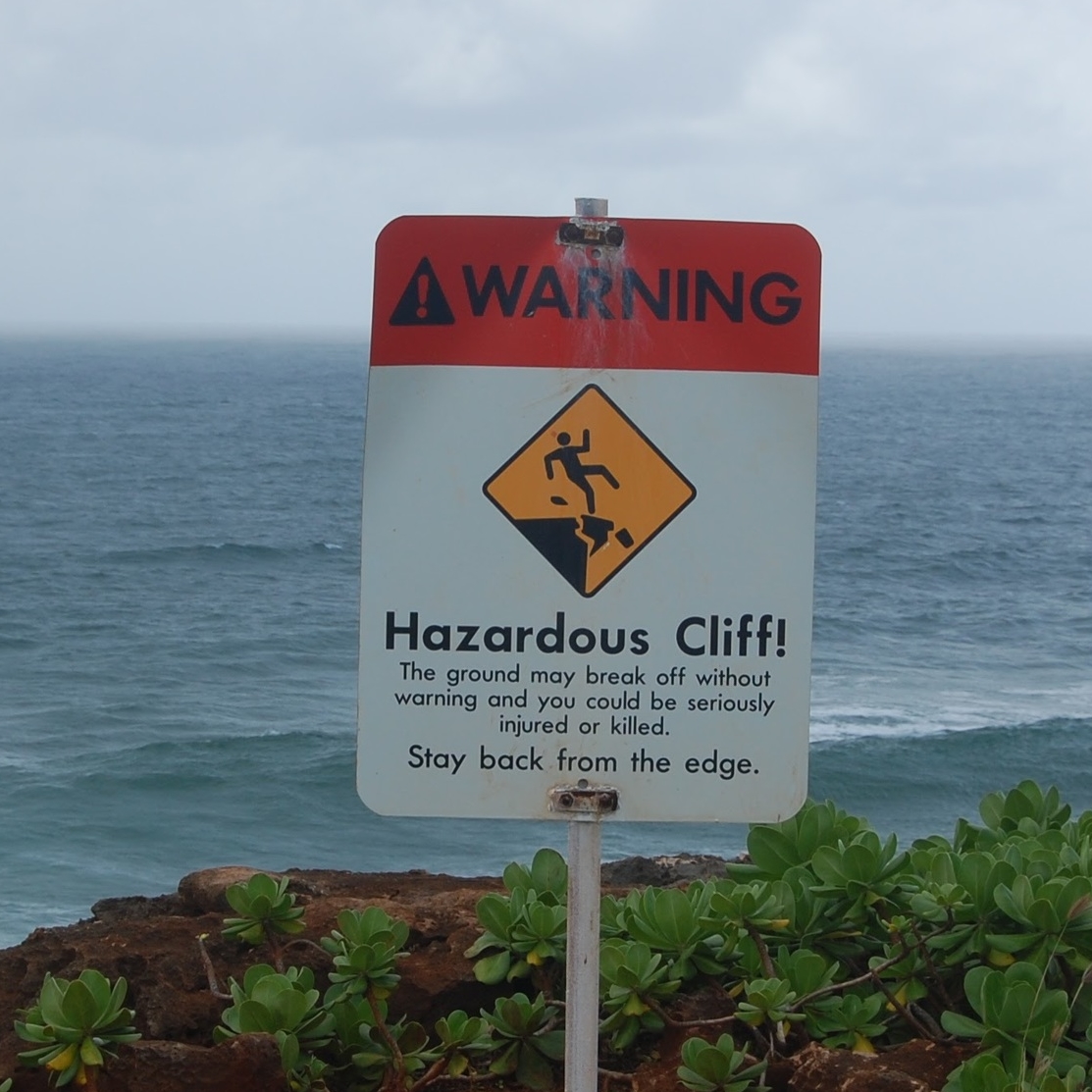
While on vacation several years ago in Kauai I discovered a few signs that commanded attention through blunt language and vivid imagery, describing scenarios you would take just just about any precaution to avoid. Looking back on them, they are excellent examples of user experience design. When I saw them I thought, "That is good to know. Thanks for the heads-up!" And I wasn't the least bit sarcastic.


