
Dollar Shave Club--The Next Evolution of the Razor-and-Blades Business Model

I love Dollar Shave Club. I've been a member since the beginning and have been beyond satisfied with the quality of the razors, especially for the price. As a user of the middle-tier 4X I pay just $6 for 4 cartridges! This is less than half the price of any leading name-brand razors. Suffice it to say I am hooked. Why would I go back to paying more when they conveniently ship me a new pack every other month?
But now the game has changed and DSC appears to be taking a page from its thoroughly disrupted competition's playbook. Wikipedia defines the razor and blades business model as "a business model wherein one item is sold at a low price (or given away for free) in order to increase sales of a complementary good, such as supplies." This namesake business model is in full effect as they continue to add new products in an effort to take over my entire bathroom experience; blades are the new handles, and accessories are the new blades.
The expansion began slowly at first when they rolled out shaving cream and after shave. $8 for a tube of Shave Butter. $9 for the Mangnanimous Post Shave Cream. While not off the charts, these are a far cry from the bargain they reeled me in with. Lately the new products are coming even faster: $7.50 for 2 two bars of soap. $9.50 for a bottle of body wash. $4 for a single lip balm (or just $6 for two, to be fair.)
They're a brand you want to love, and they managed to be affordable without seeming cheap. Now that they have 10 million members they are moving decidedly up-market, which may have been their plan all along. A pretty clever way to beat the competition at their own game.

Re-Re-Designing the Thermostat
Thermostats ask us what temperature we would like. Maybe that's the wrong question and they should simply ask us if we are warm, cold, or comfortable.

Based on years of office, hotel, and meeting room experience I believe that we will have truly advanced as a society when we master indoor temperature control. When in July people are bringing sweaters to wear inside and are putting space heaters under their desks, there must be room for improvement. Perhaps the last mile of this problem has less to do with the heating/cooling technology itself, and everything to do with how we express our feelings to the machines that control the flow of hot and cold air.
Consider the thermostat. in The Design of Everyday Things, Don Norman addresses the well-intentioned but counterproductive way we interact with them. If we're a little cold, we turn up the temperature a little. If we've very cold, we turn it up a lot--often to a much warmer target temperature than we're interested in, because we think it will warm up faster that way. Of course that's not the case, and I can't tell you how many times I've walked into a sweltering room only to see that the thermostat was set to 85 degrees.
It occurred to me the other day: what if you didn't give it a temperature at all? Truth be told I don't care what the number is as long as I'm comfortable. Rather than inputting a number, perhaps the thermostat of the future will only require us to tell it if we are hot or cold. Then it can make the adjustments and check in to see if we're happy with the result.
From the user's perspective the number is just an arbitrary scale to represent comfort. Why not do away with it and focus on the comfort itself?

Timing is Everything
I love my Kindle. When I got it years back it was a revelation. It is a nearly invisible piece of technology, in part because the battery lasts for weeks. But the timing of the low battery warning leaves something to be desired.
I love my Kindle. When I got it years back it was a revelation. I had never much thought of myself as a reader but the Kindle taught me that I love reading--I just didn't much care for books (sorry, booklovers.) While there are definitely some things I miss about paper books, like being able to easily flip back and refer to previous pages, by and large I think the Kindle is a brilliantly-designed device and I love reading on it. Here are just a few of the reasons why:
It's comfortable in one hand, and it doesn't matter which hand
It's the same size regardless of what you're reading--no more giant new-release hardcovers weighing you down
It eliminates the awkwardness of holding a lopsided book when you're just starting or just finishing
It's immersive. Experientially it's not a 'device' at all; it's a book. If I did my reading on an iPad I'd be endlessly distracted. The Kindle only does reading, and I love that about it because reading demands focus
The battery lasts so long it hardly feels like a piece of technology at all
There is one thing that I really don't like though, and it's the low battery notification. The battery lasts for weeks, so I rarely think about charging it. I am also rarely on a screen that displays battery life--I'm just reading away and when you're reading, all you see is the book text. So the only time I think to charge it is when I see this note pop up, and every time I see it I groan:

Problem is I get this message when the Kindle is very close to dying. So in that moment (which is usually in bed) I have to decide whether to keep reading and hope it doesn't die, or get out of bed to get the charger and plug it in. Given the long battery life I'd love to get this message when I have a few days of reading left, so I can choose when to charge it.
It's clear so much thought was put into the design of this product; I wonder if when designing this warning, they considered what it would be like to receive it?

The "80/20" Rule, Revisited
I've always loved graphs, as they are so effective at taking complex ideas and conveying them simply. As I was thinking recently about the relationship between the effort I put into something and the output I get as a result, a few different graphs came to mind. the "80/20" rule has been talked about a lot--the idea that there are diminishing returns to your extra efforts. But are all activities like this? I don't think so.
I've always loved graphs, as they are so effective at taking complex ideas and conveying them simply. As I was thinking recently about the relationship between the effort I put into something and the output I get as a result, a few different graphs came to mind. the "80/20" rule has been talked about a lot--the idea that there are diminishing returns to your extra efforts. This assumes that if you were to graph output against input, it would look like this:
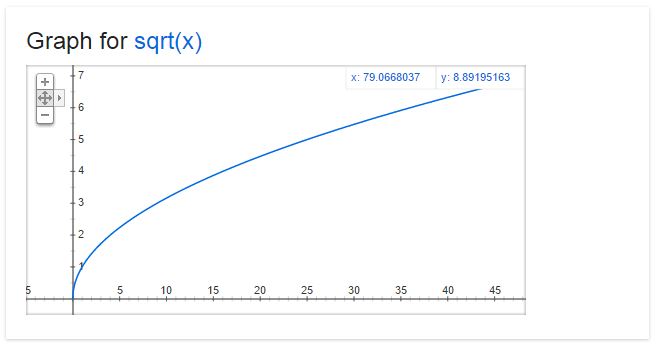
In this case even though every extra bit of effort does yield more output, the returns are diminishing and eventually the effort may no longer be worth it. For me, choosing a font falls into this category; Spending a little time is good, spending a lot of time is definitely not good. But are all activities like this? I don't think so.
Some activities have a more linear curve. When I paint my house, every extra hour of work is more or less equally productive (until I get reaaaaaally tired.) in this case there's no reason to stop at 80%.

And then there are the times where each extra bit of effort actually returns you MORE than the bit before. Think about doing push-ups, or any other exercise. Those last reps, when you're so tired you can barely hold yourself up, are the ones that give you the most benefit. In this case the 80/20 rule goes out the window again, and it actually makes sense to give it everything you've got.

Here's what I started to wonder: what if a lot of activities are actually in this third category? Perhaps it's worth it to give it everything we've got way more often than we think. Sometimes you build up momentum, and sometimes perfection really does matter. At the very least it's good to know what kind of function you're dealing with so you can make an educated choice of how much energy to put in.
Thanks to Google for the graphs. Search results these days are amazing!

We've Been Warned
Warning signs and labels are everywhere these days, protecting us from ourselves in ways most probably never thought would be necessary. "Careful, the beverage you're about to enjoy is extremely hot" is one of my favorites. Thanks for the heads-up, Starbucks! Because of their ubiquity it's easy to become desensitized and not take them as seriously as perhaps we should.
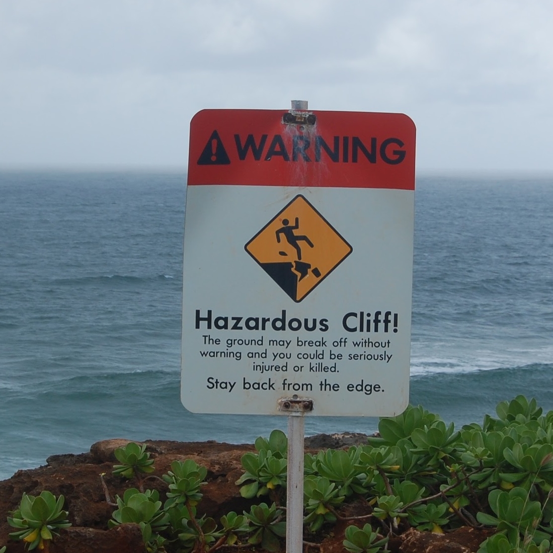
While on vacation several years ago in Kauai I discovered a few signs that were hard to ignore.
Warning signs and labels are everywhere these days, protecting us from ourselves in ways most probably never thought would be necessary. "Careful, the beverage you're about to enjoy is extremely hot" is one of my favorites. Thanks for the heads-up, Starbucks! Because of their ubiquity it's easy to become desensitized and not take them as seriously as perhaps we should.
While on vacation several years ago in Kauai I discovered a few signs that commanded attention through blunt language and vivid imagery, describing scenarios you would take just just about any precaution to avoid. Looking back on them, they are excellent examples of user experience design. When I saw them I thought, "That is good to know. Thanks for the heads-up!" And I wasn't the least bit sarcastic.


The New New Nutrition Label
At long last the nutrition label is getting a makeover. The new information will be an asset, but the numbers-first design is still uninformative to people who can't visualize what 10 grams looks like. Here is a visual approach to helping people understand what they're eating.
At long last the nutrition label is getting a makeover, thanks in part to the First Lady. As someone interested in health and nutrition, I'm pretty excited. As an up and coming user experience professional I can't help but think, "what will this be like for the consumer?"
Including "added sugars" is a big deal because up till now it's been hard to tell where a product's sugar is coming from. Fruit has sugar in it. Plain yogurt has sugar in it. So it will be nice to know how much of the sugar in your strawberry yogurt comes from strawberries and yogurt, vs. corn syrup or cane sugar.
But I still believe that for the average consumer, context is missing. A typical American has no idea how much a gram is. We can't picture 10 grams of protein or 20 grams of sugar, which makes it difficult to understand what we're really eating. It's not all the metric system's fault though; I don't think we'd understand 0.35oz any better. The amounts of nutrients in a single serving are just too small to visualize.
When I read a nutrition label I'm less interested in the amount of each nutrient than the proportion of nutrients. It's interesting and helpful to understand that by weight almonds are 50% fat, and about 20% protein. And if somebody saw that what they were about to eat was 50% sugar they might think twice. There are limitations to this, to be sure. A can of coke is 355ml, which is roughly 355 grams. It contains 39g of sugar so it is only about 11% sugar by weight, which doesn't seem so bad. But almost all of the other 89% is water, and there are no other nutrients besides that sugar.
Below is a mock-up I have been thinking about for a while. It's not perfect but it could help people better understand what they are eating, which to me is the whole point of the nutrition label to begin with. What do you think?

What the world needs now is em pa-thy
I've been thinking lately that government could use a dose of design, namely two concepts: empathy, and prototyping.
I've been thinking lately that government could use a dose of design, namely two concepts: empathy, and prototyping.
Empathy
Imagine a world where our leaders (and citizens-at-large, for that matter) were interested in hearing what each other had to say, and not just so they could disagree or prove each other wrong. If they were to say things like "how could this work?" "What do you mean?" "Tell. Me. More."
There's no time quite like the heart of a US Presidential election cycle to experience the exact opposite of empathy and curiosity. People are so certain their views are correct, whether or not they have any qualifications. I don't know about you, but I'm incredulous about certainty regardless of who it's coming from.
Prototyping
Government is designed to be slow, and that's a good thing. We don't want it to be too easy to change because we need stability, and time for policies to have their intended effect. The checks and balances of government exist to make change hard, but lost in the caution is the lesson so many businesses are learning--that sometimes you just have to try something, see what happens, and adjust. When change becomes so hard that it is virtually impossible, it may be time to rethink the system.
Easier said than done. But how might we create ways to experiment at a national level in service of finding the best possible solutions to our problems? What would an agile government look like? What would a minimum viable product look like when it comes to economic stimulus, welfare, or social policies?
UPDATE, MAY 21 2016
Members of the conservative media recently visited Facebook to discuss any potential political bias on the site. While I don't agree with him often, Glenn Beck's recounting of the experience is a great example of how empathy and a willingness to not know can further a conversation. There is nothing to fight with in his story; it is of a man trying to understand the truth by looking through everyone's eyes. Thank you Glenn. I hope people on both sides of the aisle continue to think more like this.
The Bottom Button
Appreciating the finer design details in life, like the orientation of a dress shirt's bottom button hole
Seinfeld famously began and ended with a thoughtful discussion on the importance of a dress shirt's second button (it "literally makes or breaks the shirt.") While I do totally agree with him, I also believe that the bottom button--specifically the bottom button hole--is an unsung hero of clever design.
Have you ever noticed that sometimes the bottom button hole is vertical like all the rest of them, but every so often it's horizonal? I always wondered why until the the other day. I was admittedly struggling a little bit to unfasten the second button from the bottom, having a hard time getting the angle just right. Eventually I got it and I happened to notice that after that struggle, the bottom button came open like a dream. "That's odd," I thought, until it hit me: the bottom button hole is horizontal so that it's easier to open and close. This angle makes total sense since you're coming at it from the top vs. from the side, as with the upper buttons.
What a wonderful example of someone putting thought into something that makes our lives ever-so-slightly easier, even though we may never notice.
Now the only question is why they don't put the one above it at a diagonal...
‘Diet’ Isn’t a Four Letter Word
The word "diet" has come to describe what we don't eat, more than what we do eat. Let's flip that around and pay more attention to what we do eat than what we don’t.
‘Diet’ is a funny word. When we talk of an animal’s diet, we’re referring to what they do consume. A giant panda’s diet consists almost entirely of bamboo. A frog’s diet consists mostly of insects. Gorillas eat a varied diet of fruit, leaves, seeds, and bugs. So why when we talk of human diets are they almost always diets of exclusion?
Human diets are defined by what you cannot eat: Low-fat. Low-carb. Gluten-free. Paleo. Vegetarian. Vegan. We are obsessed with identifying what not to consume, as though that is more important than identifying what we should consume. As a matter of practicality this is very efficient: it is straightforward to list what you can’t eat, and rather endless to list what you can. However it creates a mindset of avoidance that, while encouraging healthy choices day by day, paints food as an adversary to be managed, rather than a source of nourishment to be revered.
The availability of food that is bad for you is a modern problem to be sure, and one that must be dealt with. Had early humans ever encountered a Twinkie tree, they would have been wise to set up camp around it. Perhaps rather than vilifying the bad foods, we should focus more on praising the good ones. Which is why I propose a new take on the human diet:
Pay more attention to what you do eat than what you don’t eat.
The jury is out on whether eggs are good for you. And meat. And gluten. And butter. But there are some things we know with reasonable certainty:
Broccoli — good!
Chocolate cake — not as good
Bananas — good!
Four strips of bacon every morning? Maybe just every other.
So…eat the good stuff! At least some good stuff. Have a vegetable with every meal. Snack on a banana or an apple before you reach for the chips. The culture of avoidance we have created is just not sustainable. It makes for an experience of deprivation — of wanting what you can’t have, and not appreciating all the amazing things you can have.
The best part is that focusing on the good stuff is a win-win. First of all, you’re eating good stuff! Your body is a machine fueled by food, and it is getting the nourishment that it needs. You wouldn’t put diesel in a car designed for unleaded, and this is no different. Second, the more good stuff you eat the less bad stuff you’ll have room for. The real problems happen when you fill up on junk and none of the good stuff finds its way in.
So I say eat that chocolate cake. And if you want a burger and fries, go for it! Drink a Coke if you’re in the mood. Just eat some vegetables too.
Shower Power
A thoughtful shower control making travel just a little bit more comfortable.
As a regular business traveler I have become especially appreciative of the little things that make staying in a new environment even just a little bit easier. I've found showers to be particularly finicky, inducing questions to myself such as "did I turn it the wrong way or does it just take a while to heat up?"
When I discovered this shower knob at the Grange Holborn in London I thought it was absolutely brilliant. This little bit of reassurance is just what a tired traveler needs. Not only is it clearly labled, but it physically "clicks" into a comfortable temperature of 38C (100.4F), so you know you've set it correctly. It's the kind of thing that, once you've seen it, makes you wonder why all showers aren't built this way?
Now if they would just put an outlet near the bed so I can plug in my phone...
Thoughfully-designed, easy-to-understand shower